
A deluxe music set for the artist “Grandson.” This collection of all of Grandson’s work put together. Its goal is to provide fans with an enjoyable set that categorizes his songs in the different styles and tones he uses within his music. This set would include 3 types of vinyl, 3 CDs, pins, 2 posters, and a lyric book. Along with a motion graphic that would be a popup web ad that would be used to promote it.
The artist Grandson, Jordan Benjamin, a newer alternative artist who uses his music to address various topics and issues that are happening today. These topics can range from societal issues to personal ones and are songs that can relate to most people.
Branding
When coming up with the title with this branding I took into consideration what’s happening in the world and how this artist would react to it. I went with the name Epidemic because many of his songs talk about current issues in the world with bold lyrics but usually in a metaphorical way. The x’s you see throughout this design is a reference to the artist, and something I wanted to keep in mind since the visuals did not reflect the previous branding. The x’s are also a way to link the albums together as a series.
Each album design includes a different concept and different style. I organized the songs on each album so they’d have a similar theme based on their lyrics and instrumentals. The colors I picked were based on this visual language I’ve created.
The title font I felt needed to be bold but modern to reflect the music Grandson makes. The secondary font needed to have some personality but is easy to read. Overall the ideas where to have the visuals stand out more than the type. The images I used throughout this project were all free use found imagery which comes from the website Unsplash,
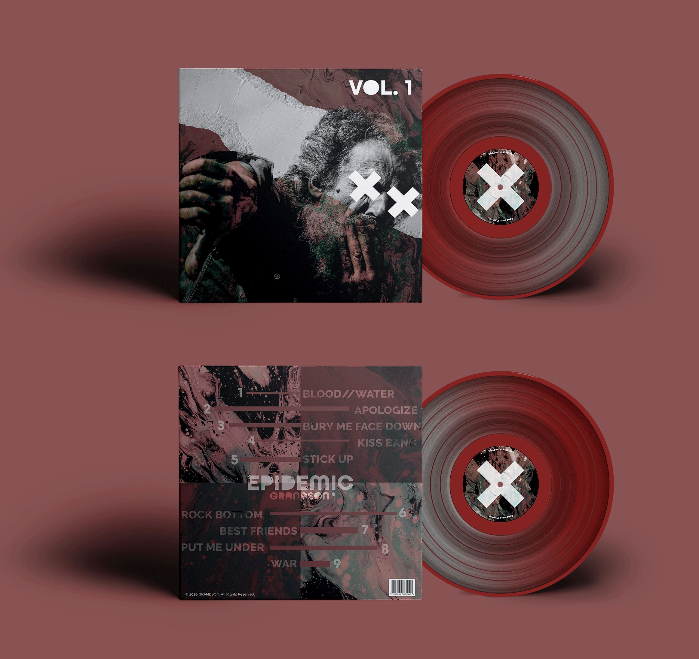
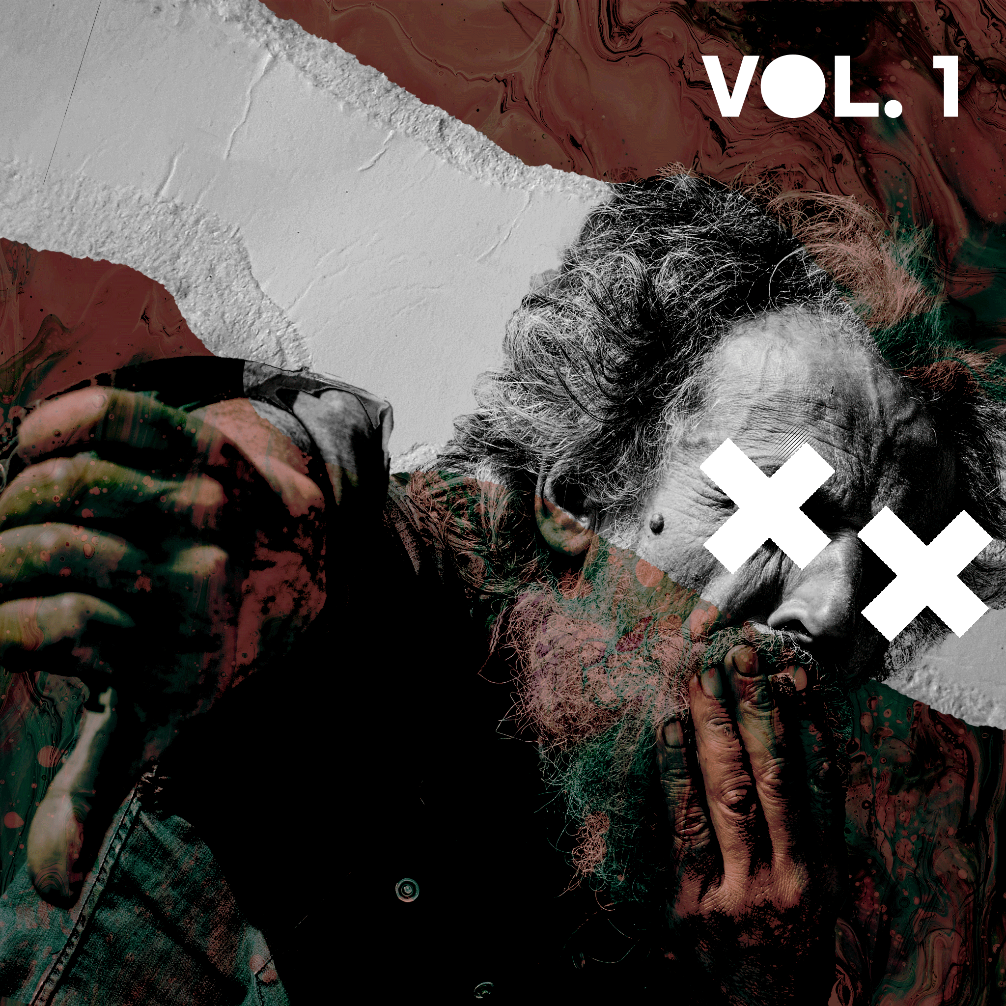
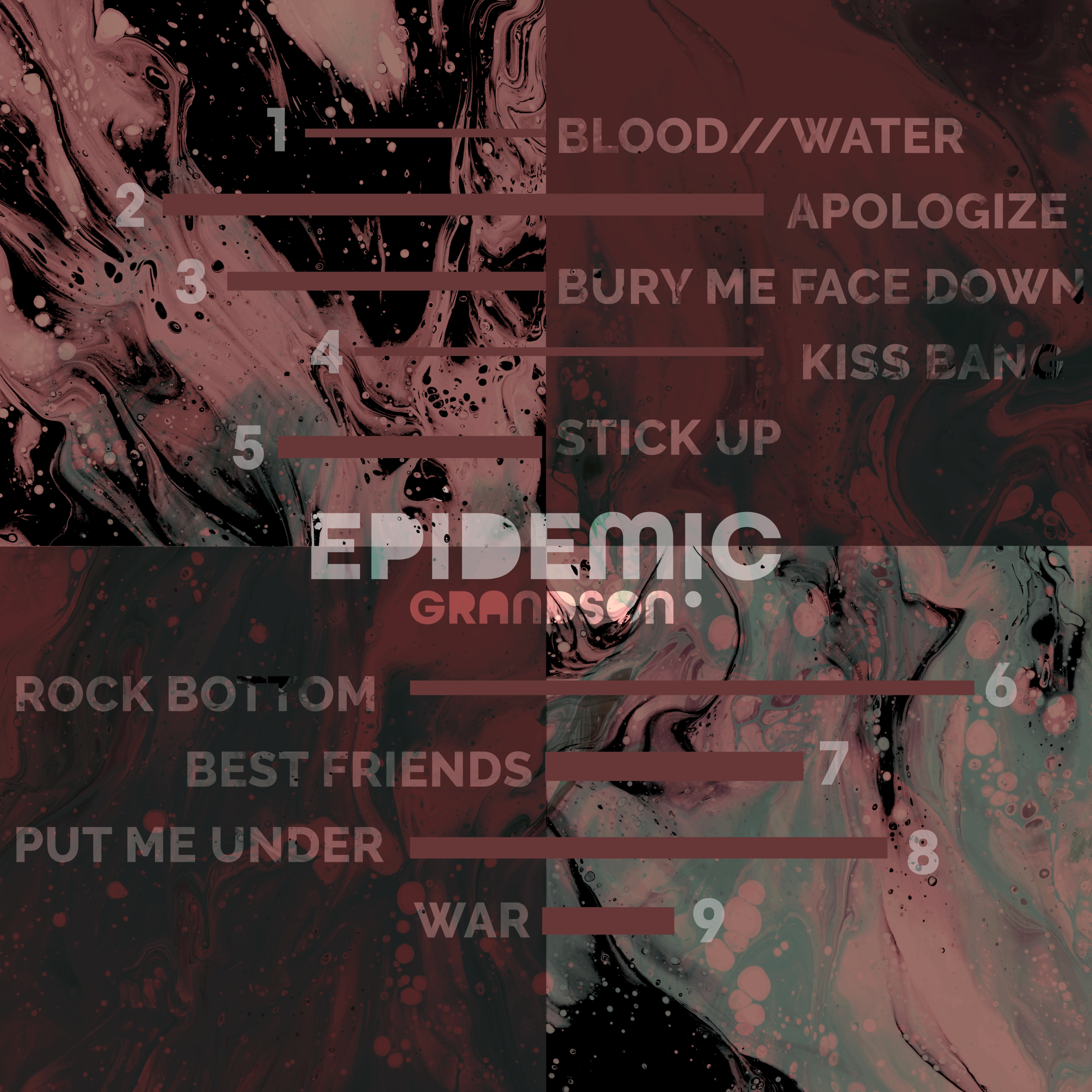
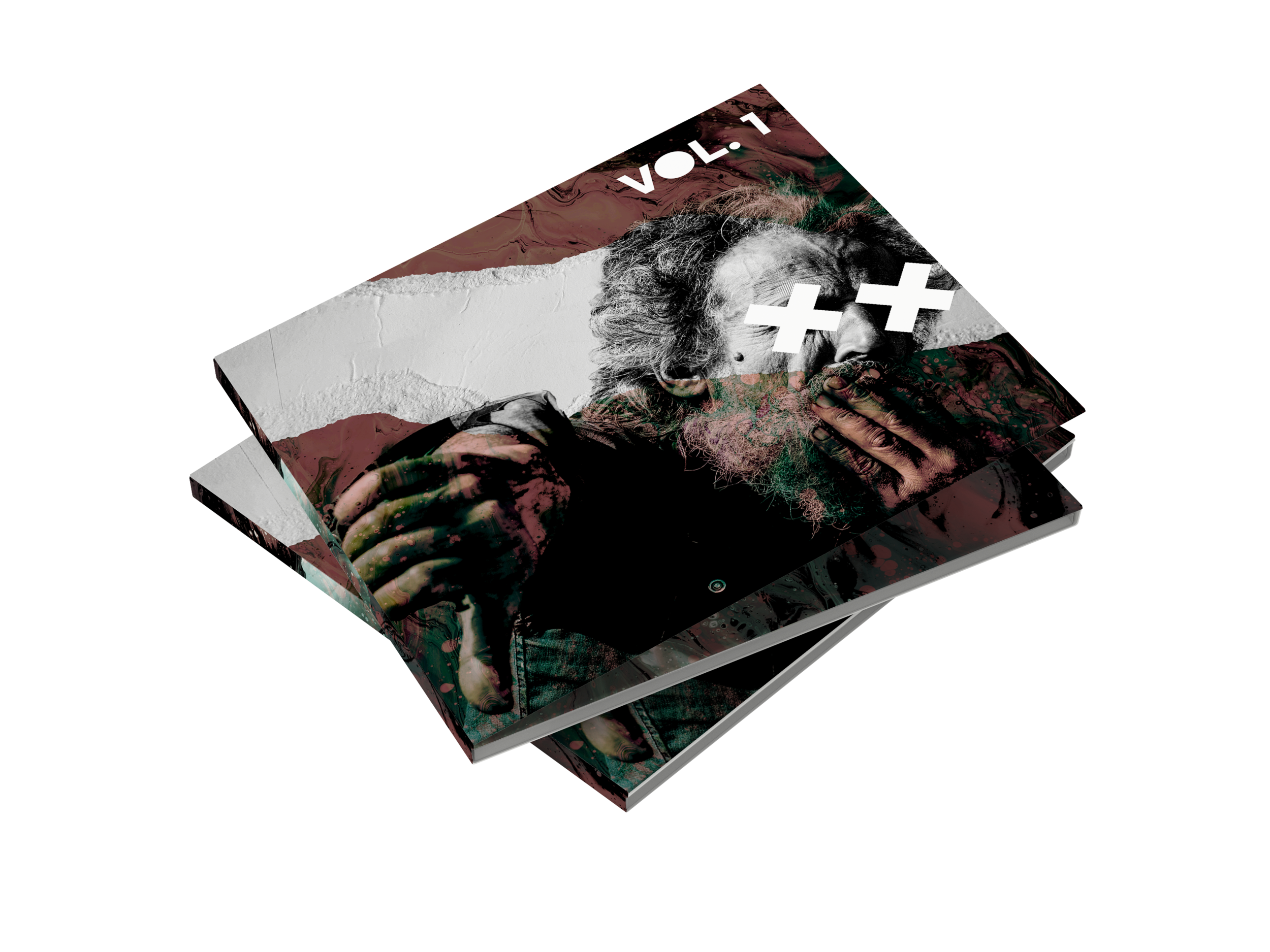
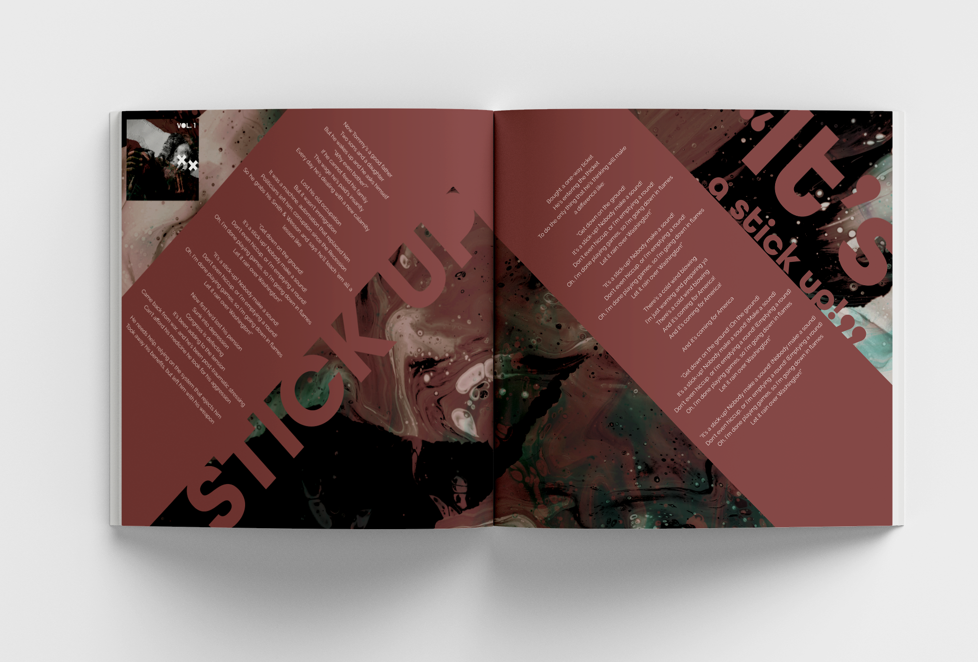
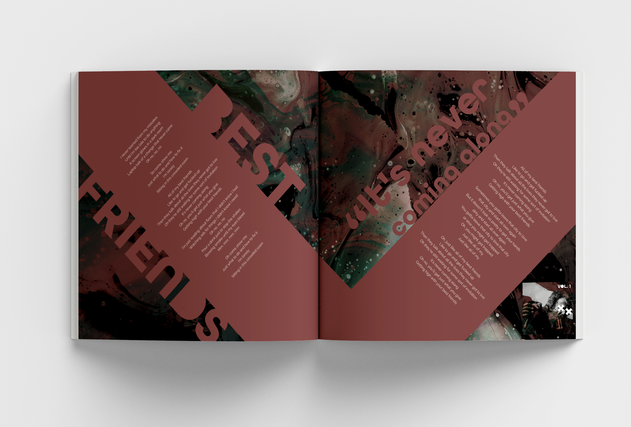
Volume 1
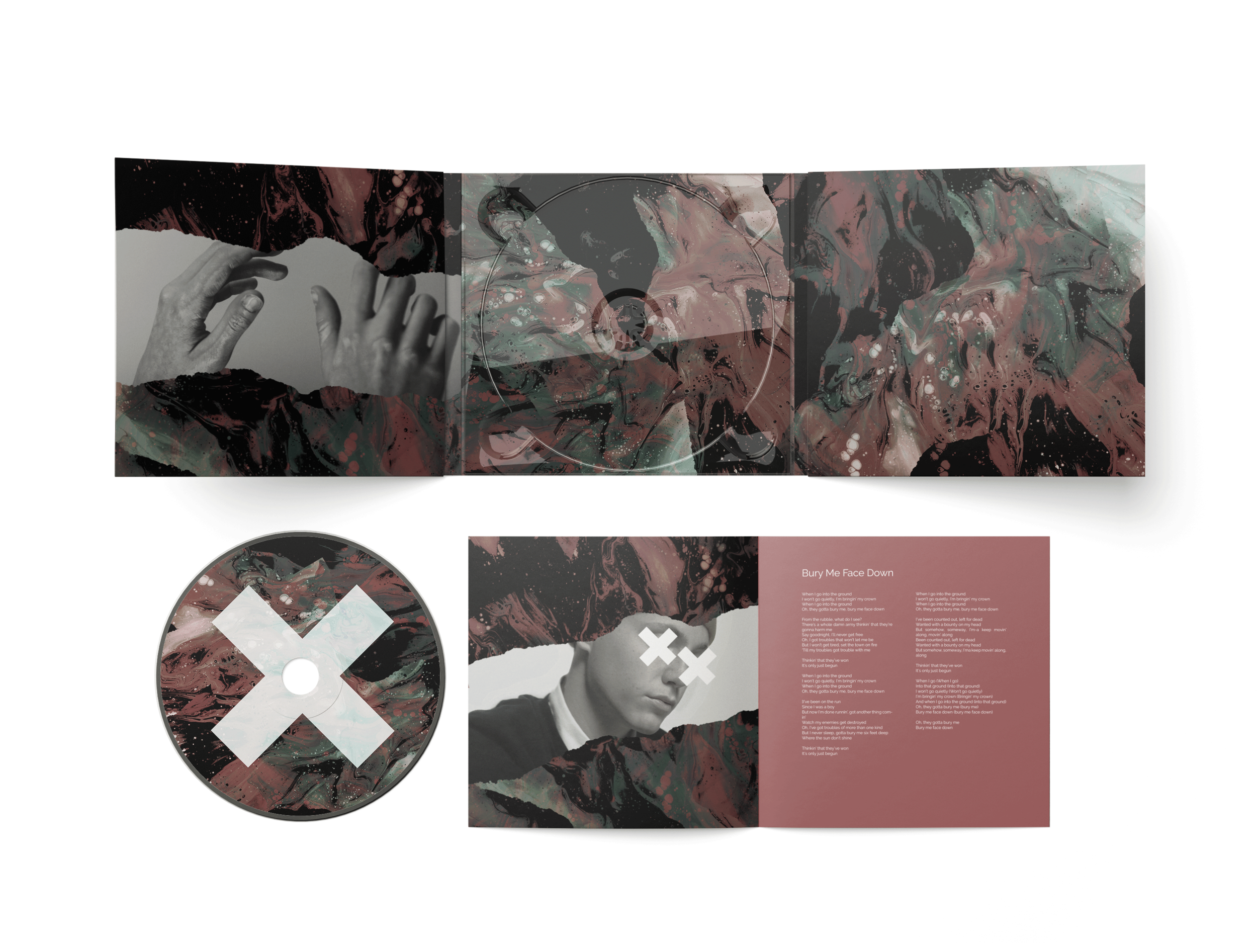
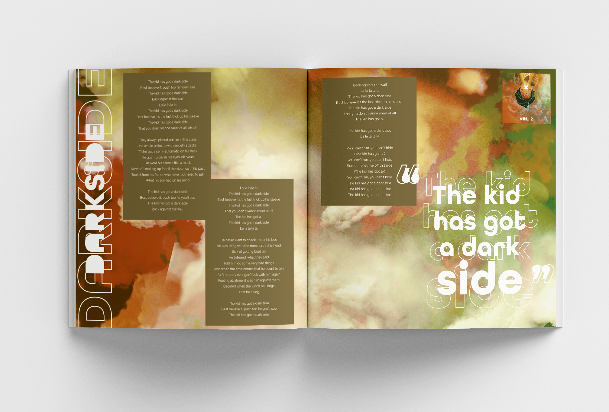
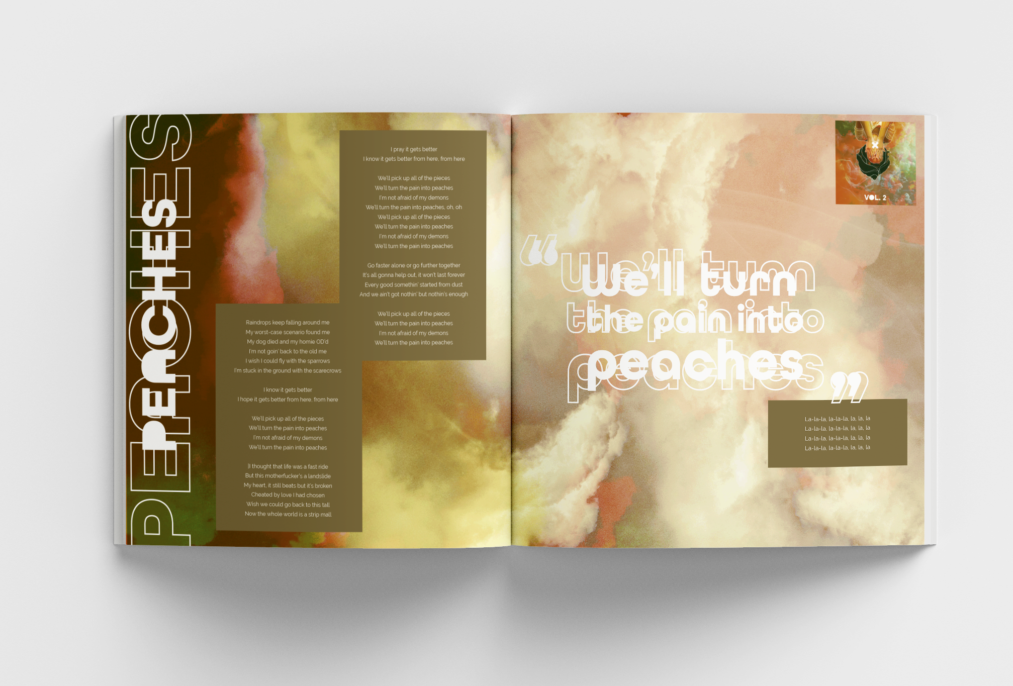
The first album of the set designed around songs that are confrontational and aggressive in their lyrics and instrumentals. The featured song was “Bury Me Face Down,” which is a song about how the songwriter or the listeners can’t be stopped from expressing their opinion unless they are buried faced down. The color is red because it’s a bold color but went with a more muted tone to make the torn grey part stand out. I also wanted each album to have at least one color from another album. The torn grey part also reflects on how you can’t silence the artist’s opinions.
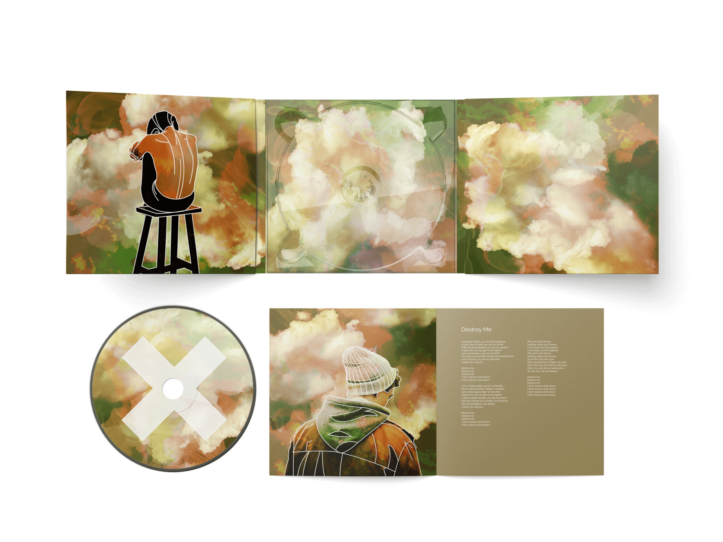
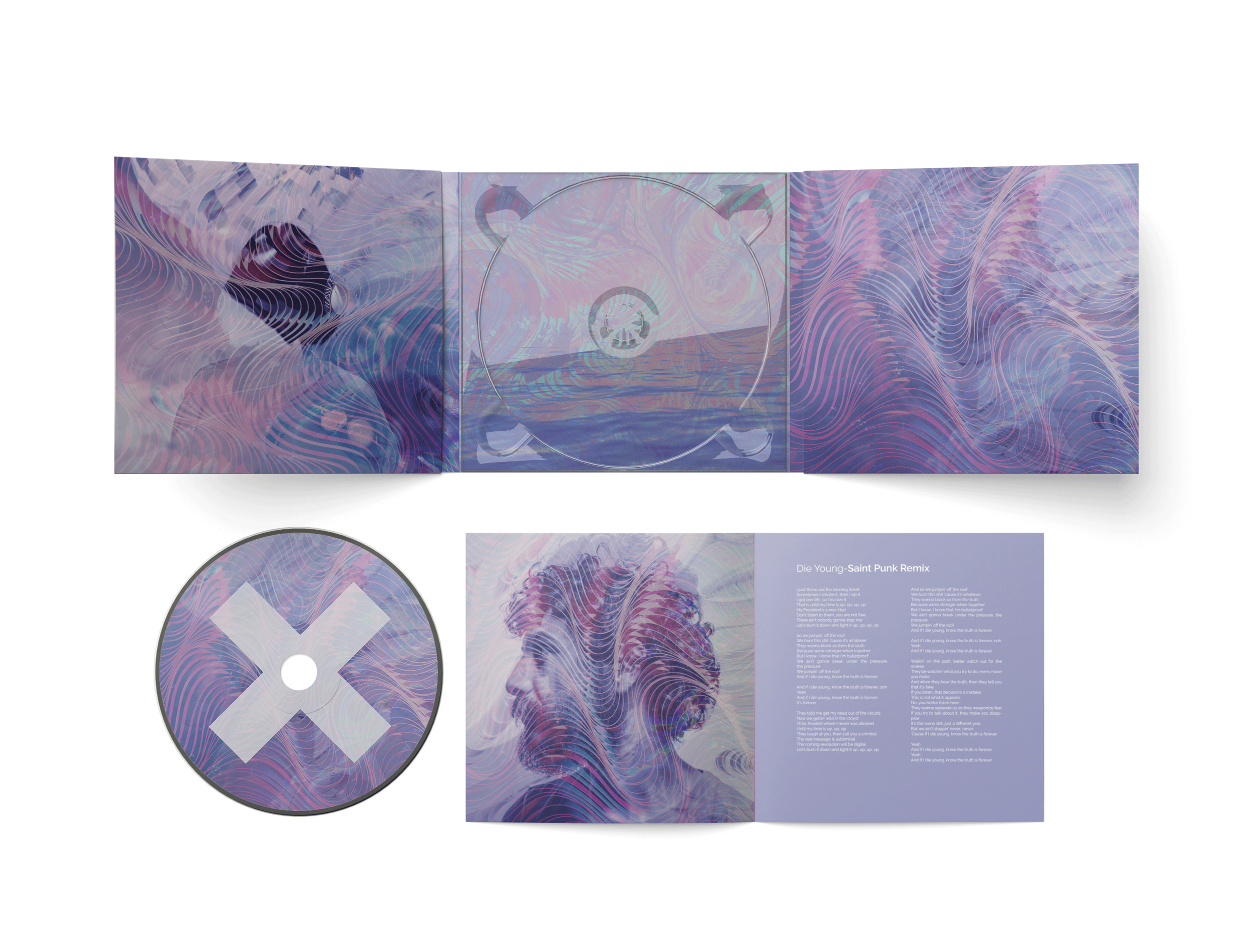
Each cd has a booklet in it with a mini lyric booklet. The colors and textures are those that mimic the vinyl and refer to the same theme from it with being more striking.
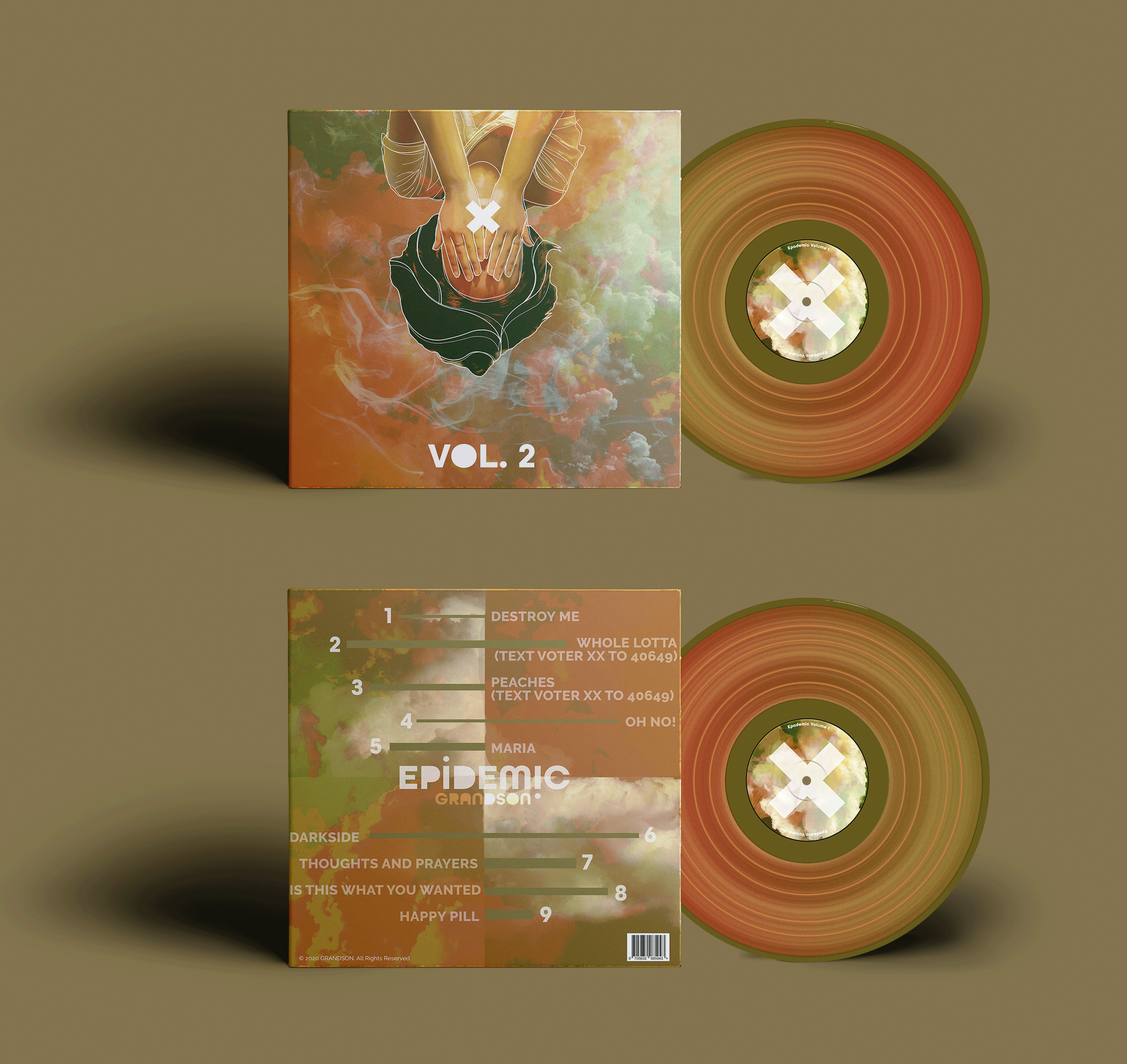
Volume 2
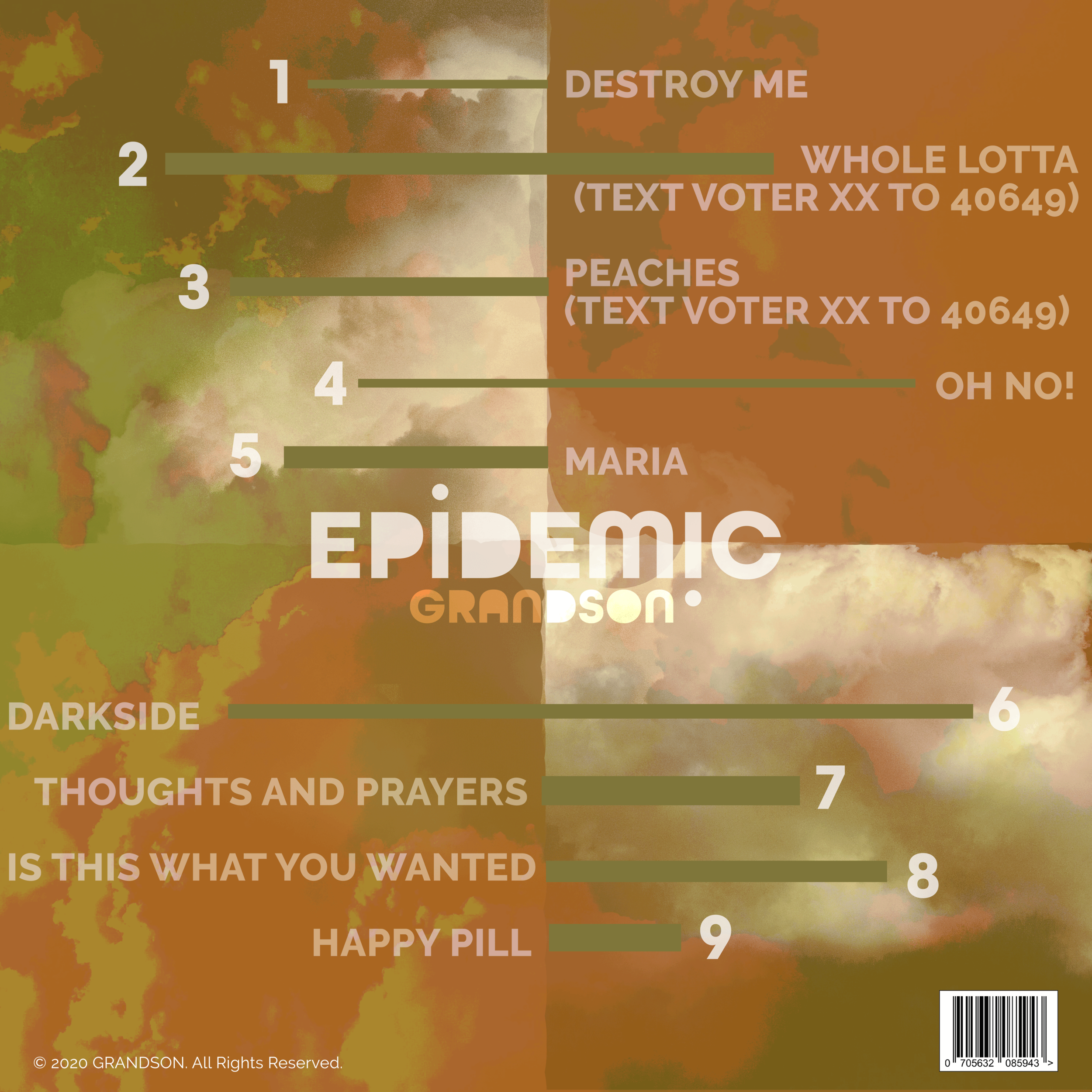
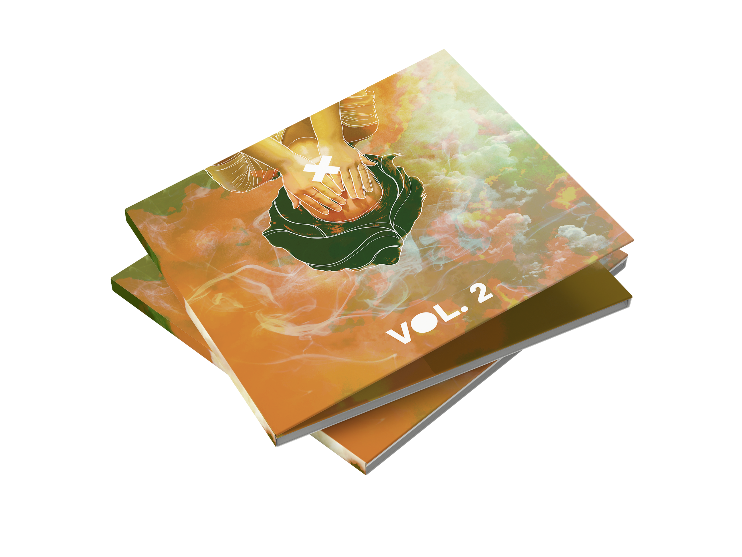
The second album is one that is more melancholy and bittersweet with its songs. A lot of them are songs about pretending to be ok or struggling with more personal issues. The main song is called “Destroy Me,” that is about an unhealthy relationship. With that, the girl is upside down instead of right side up and covering her face to push the idea that things are not ok. The lines over the girl are to imply the nervousness and stress that comes with trying to contain a lot of emotions. I chose a greenish, orange, and yellow color mostly for this album because typically those colors are viewed with happier emotions yet with the tones I wanted to give the feeling of uneasiness to the album.
As mentioned before this reflects the vinyl it’s associated with and the same message. A thing I wanted to particularly keep in mind with images is having people appear distressed or lost.
![Sad-Girl-[Recovered]-04.gif](https://images.squarespace-cdn.com/content/v1/5e7858650d61823b77782884/1592346899495-SRFNXZJOTDMY5PUUPDKV/Sad-Girl-%5BRecovered%5D-04.gif)
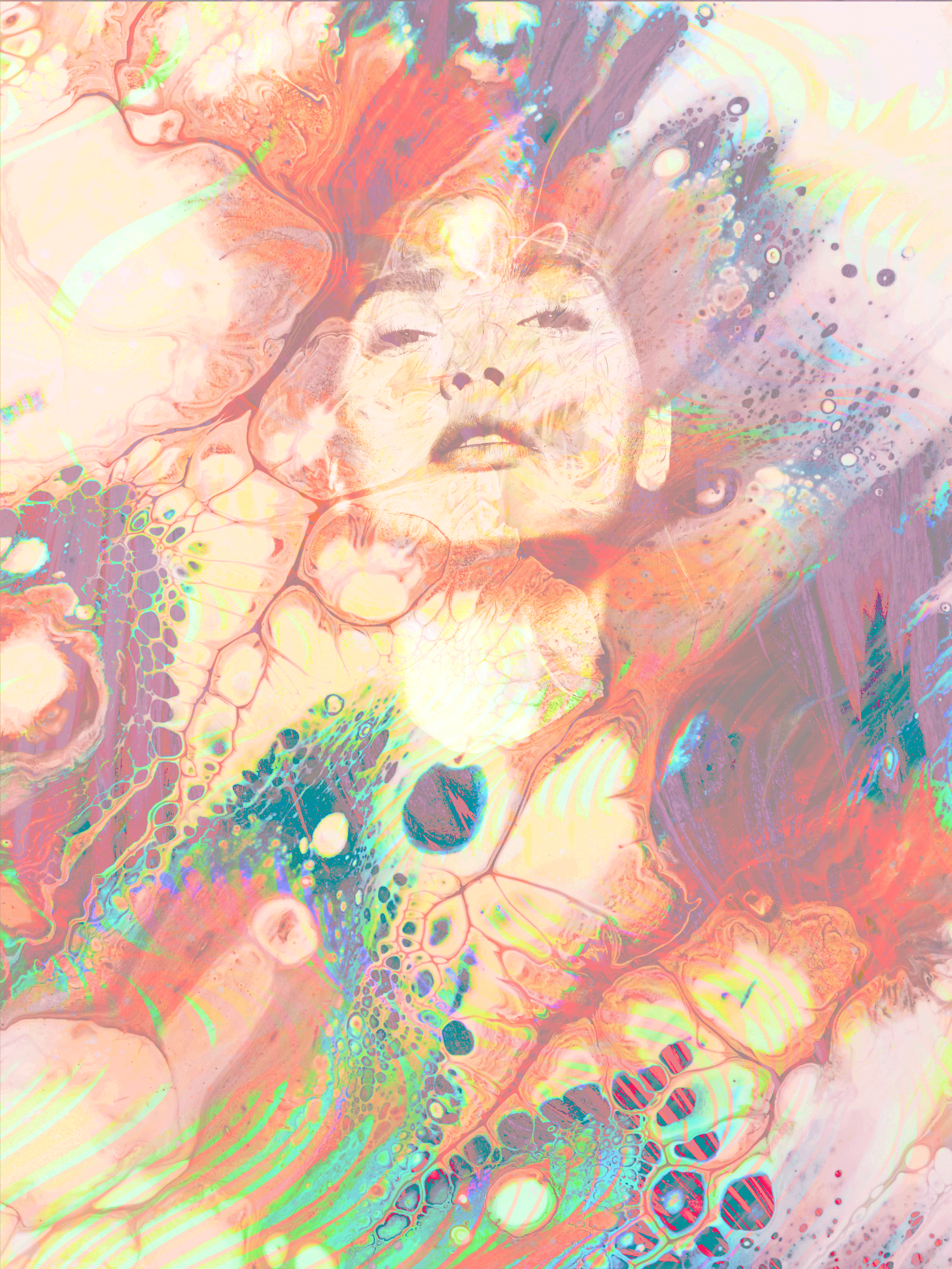
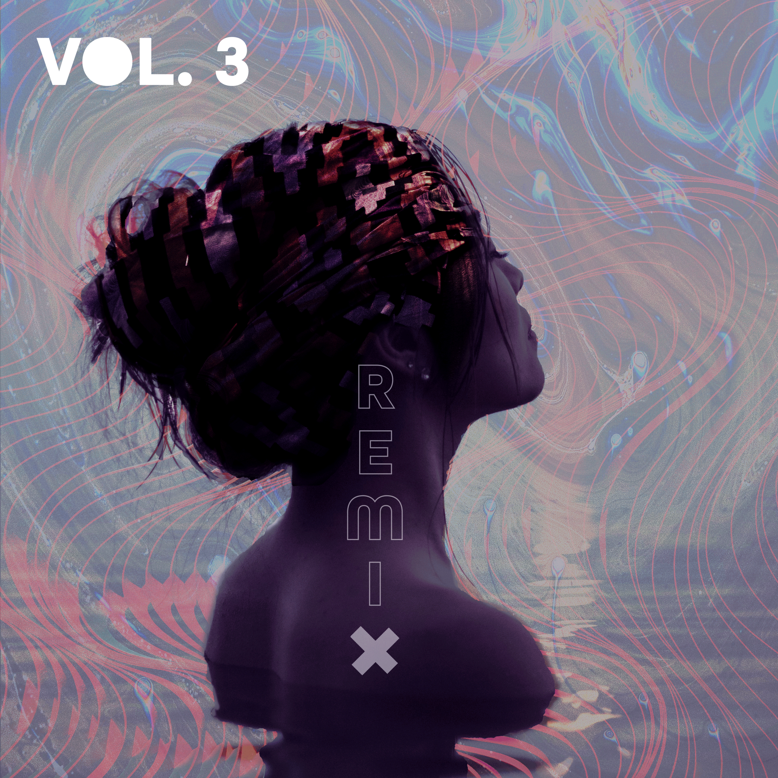
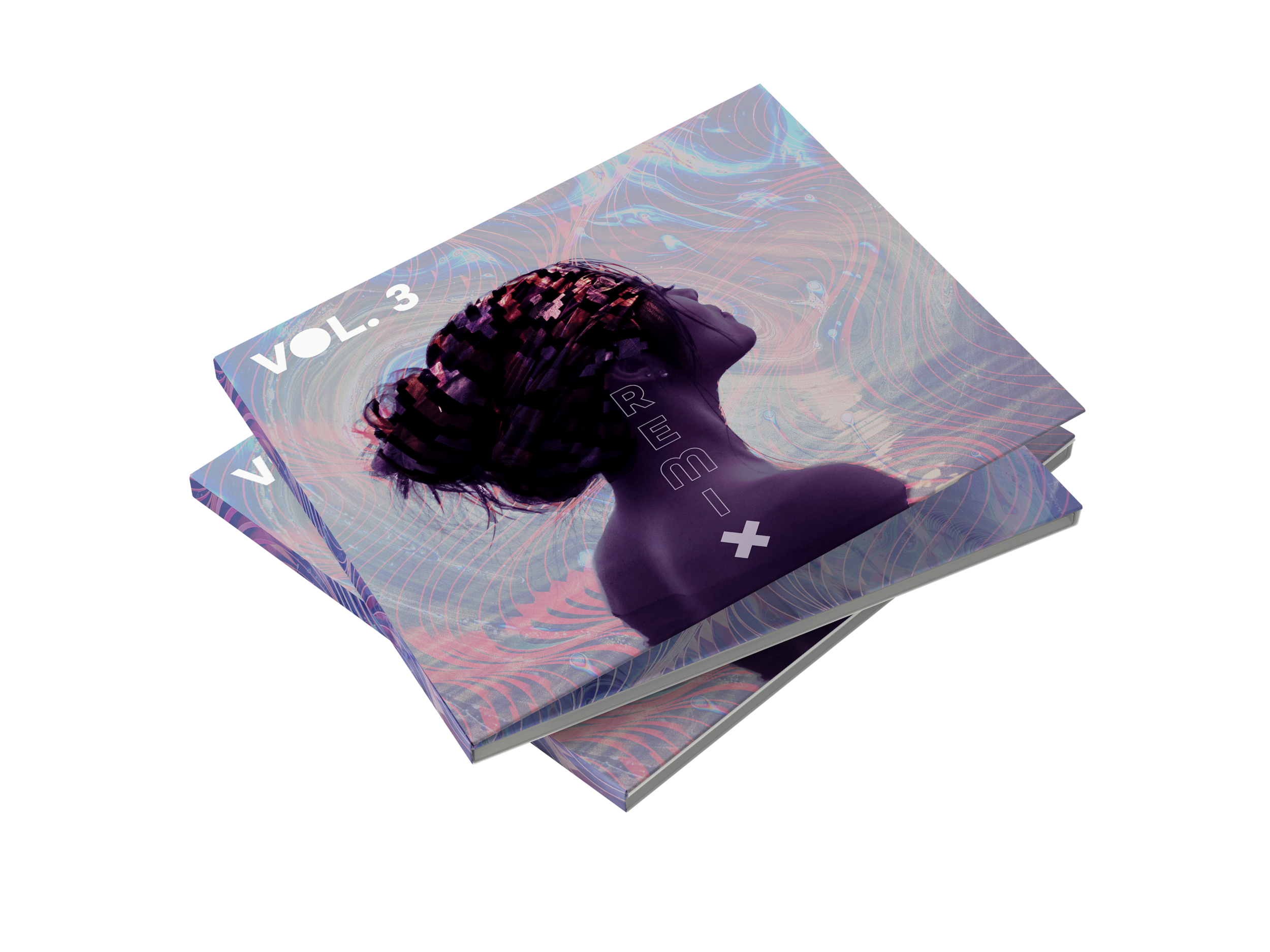
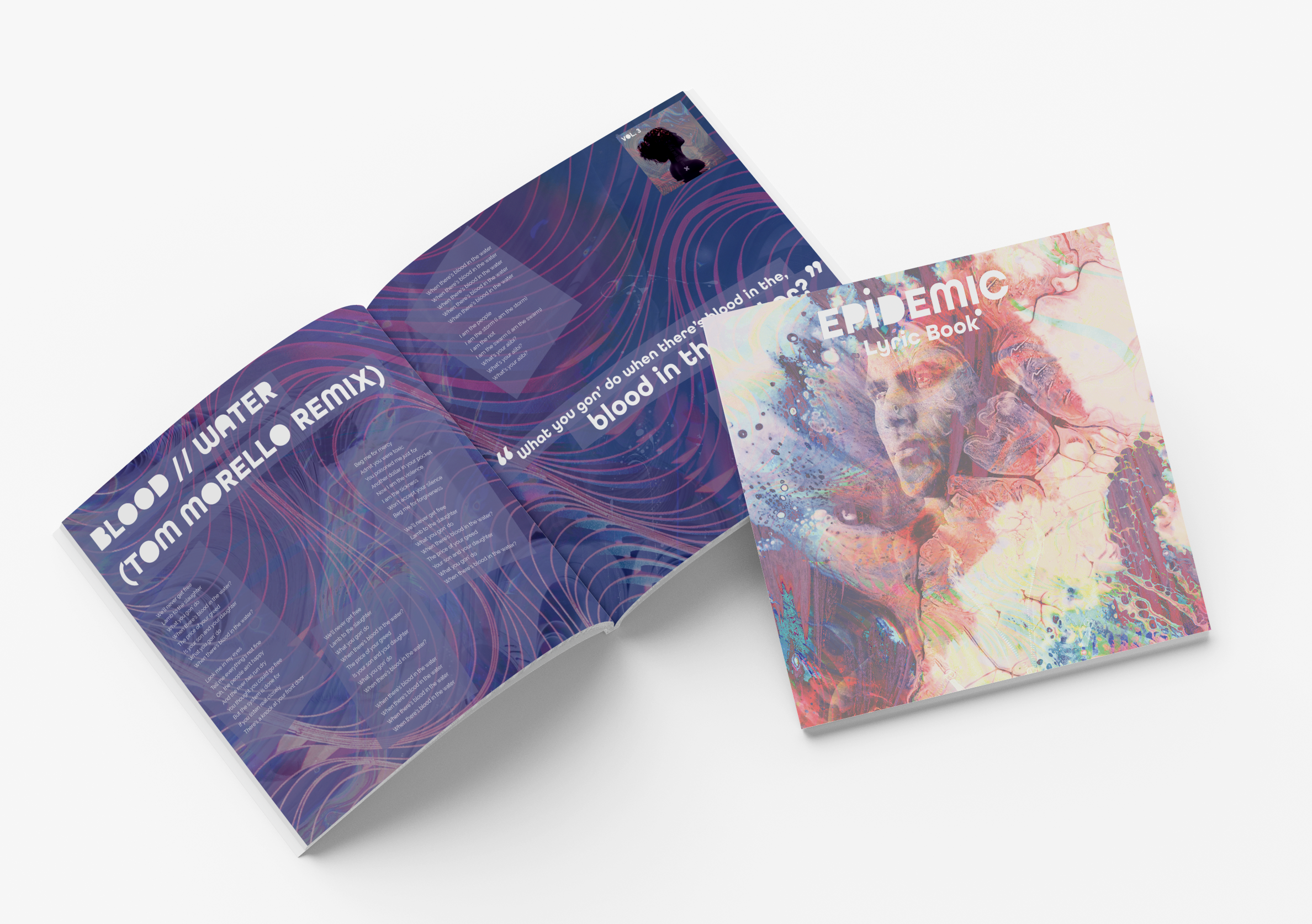
Volume 3
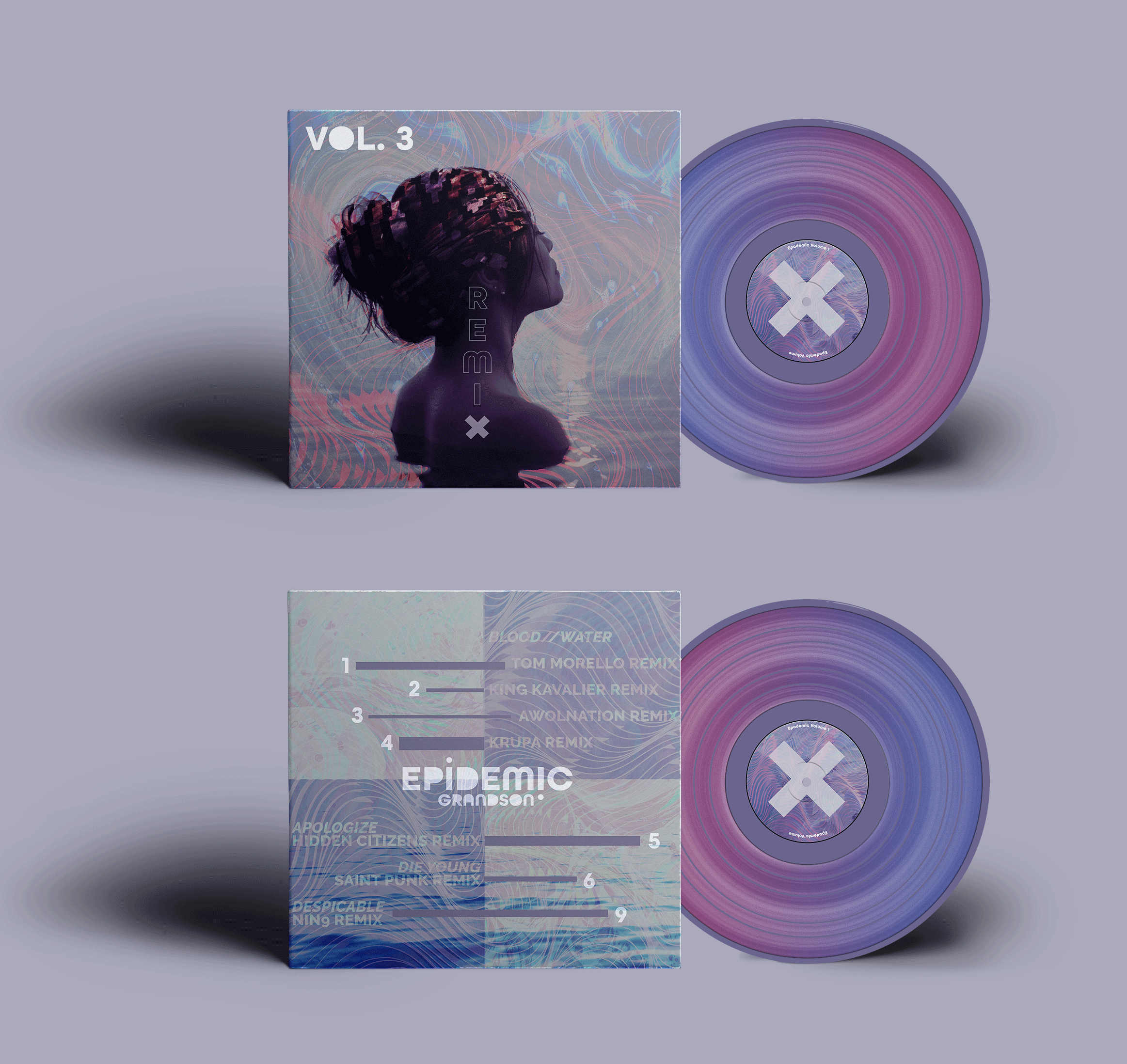
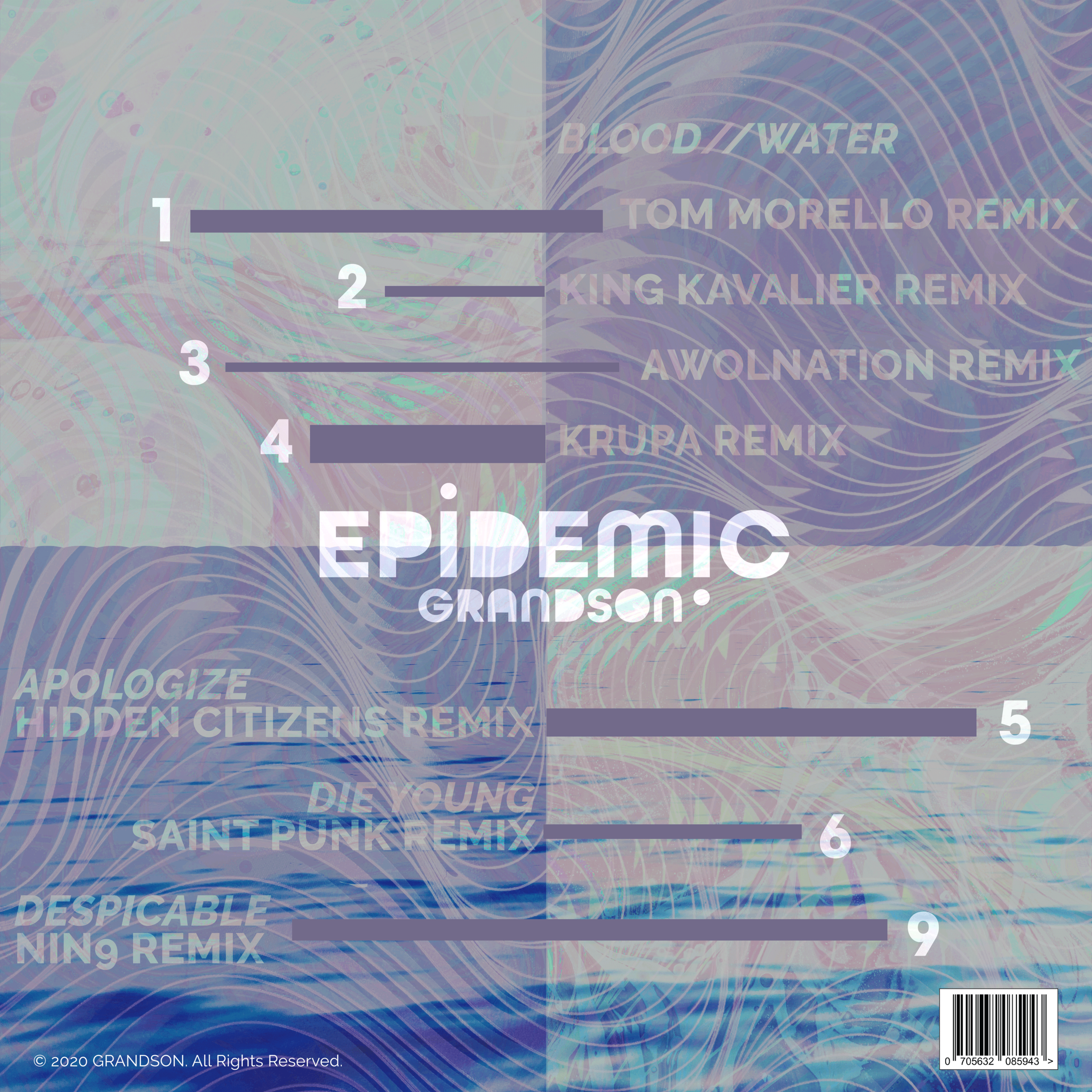
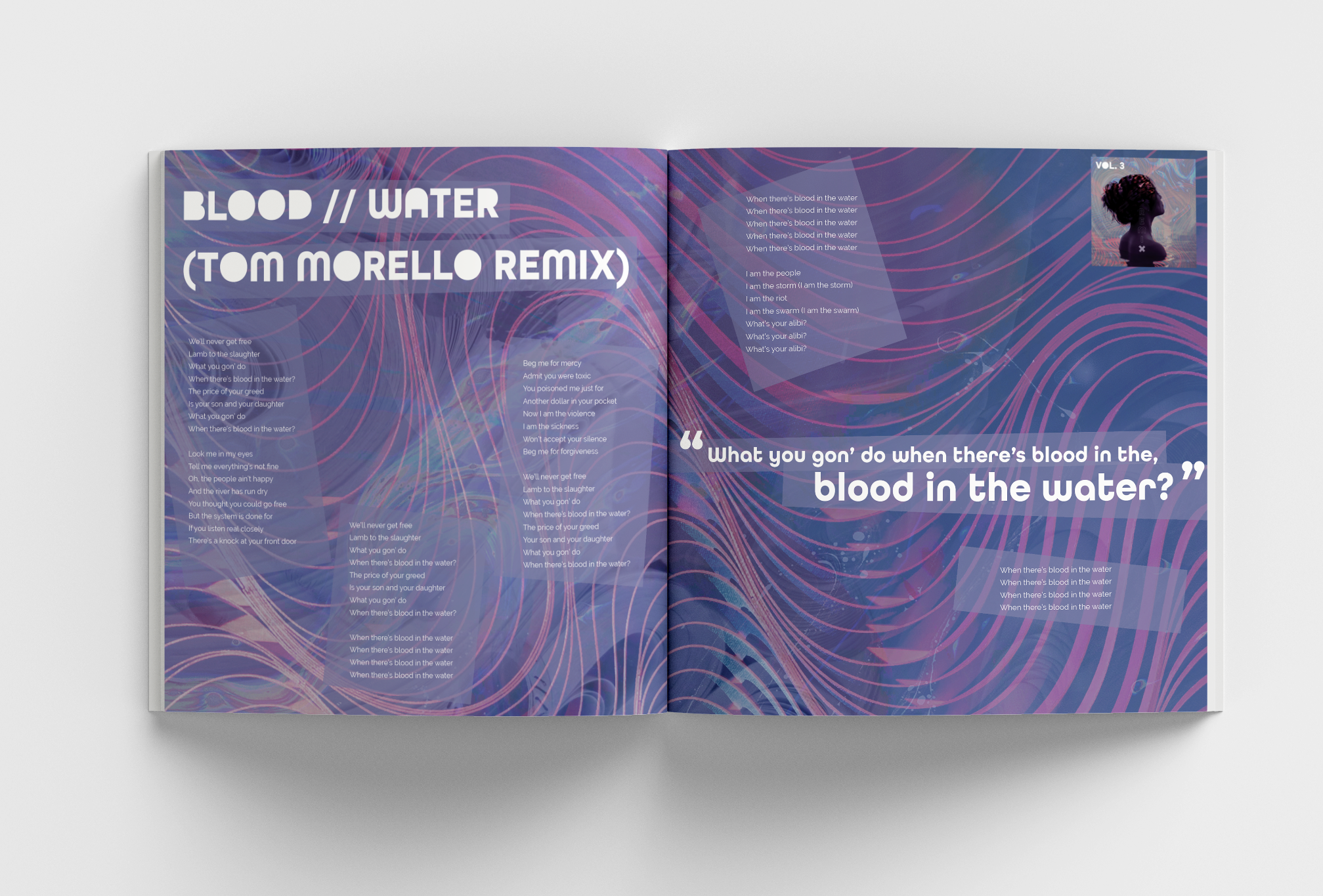
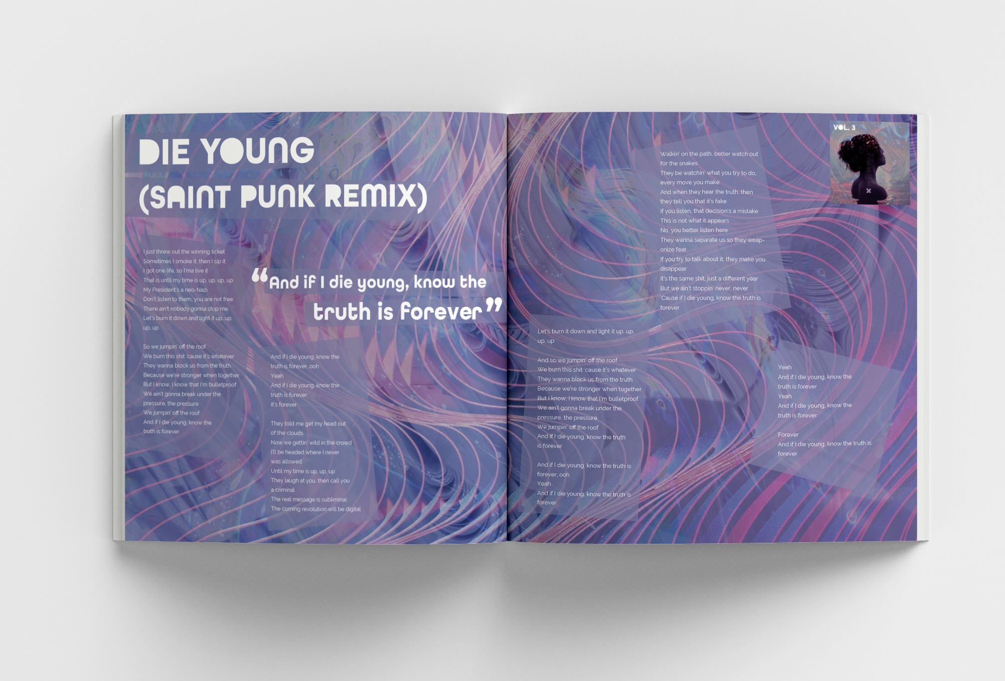
The third album contains songs remixed. The main songs are the “Blood//Water,” remixes which are 4 versions and each being a different style of a remix. The visuals are messy, whimsical, and intense to match the general theme of the remixes. The colors picked for this album stem from the song title “Blood//Water,” it’s that reason why I chose the colors to be purples and blues with a red accent.
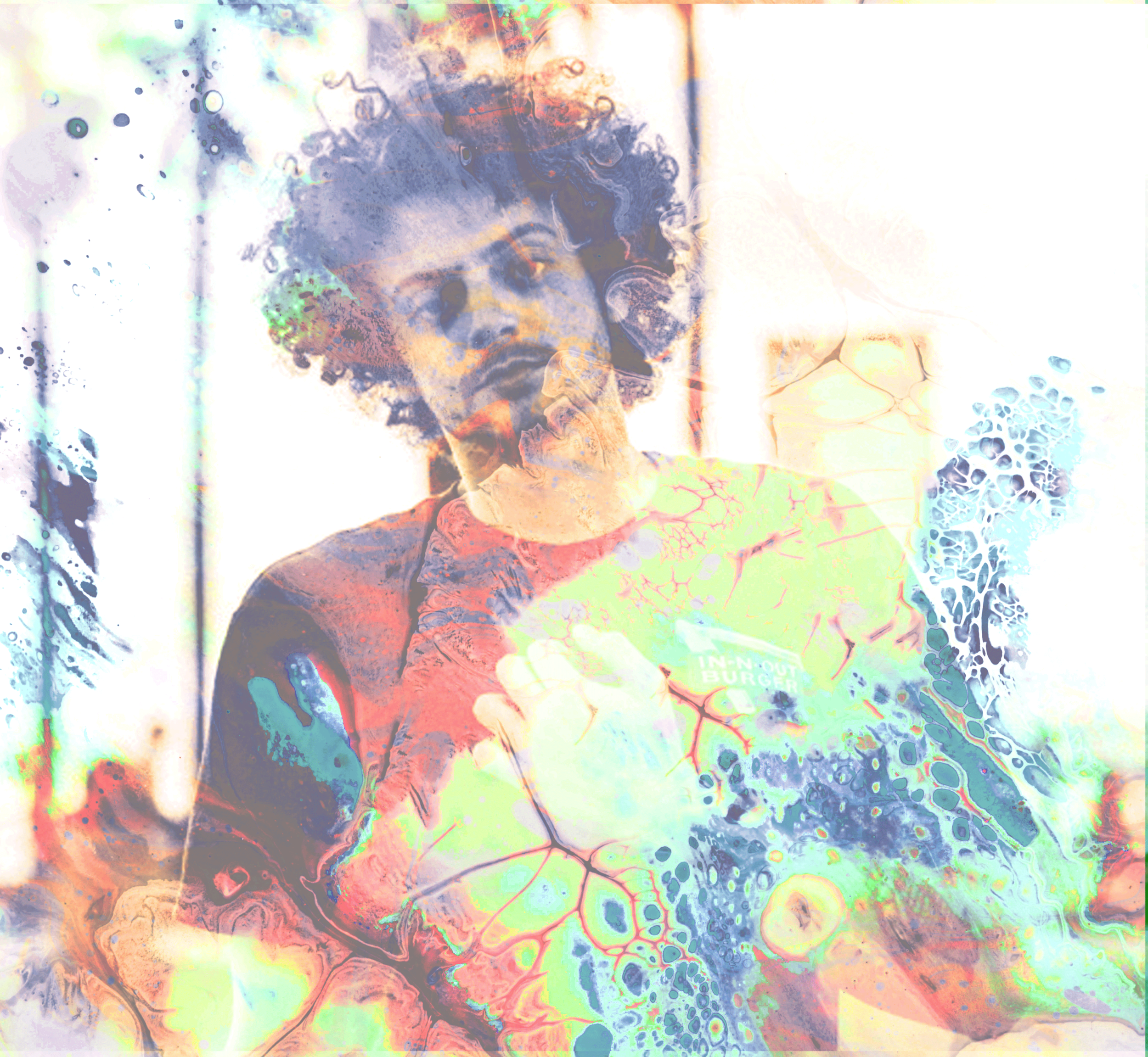
The last cd contains the same content as the other two but takes visual reference from the third album. With all the songs being remixed the songs are distorted so I wanted the visuals to also maintain that distortion.
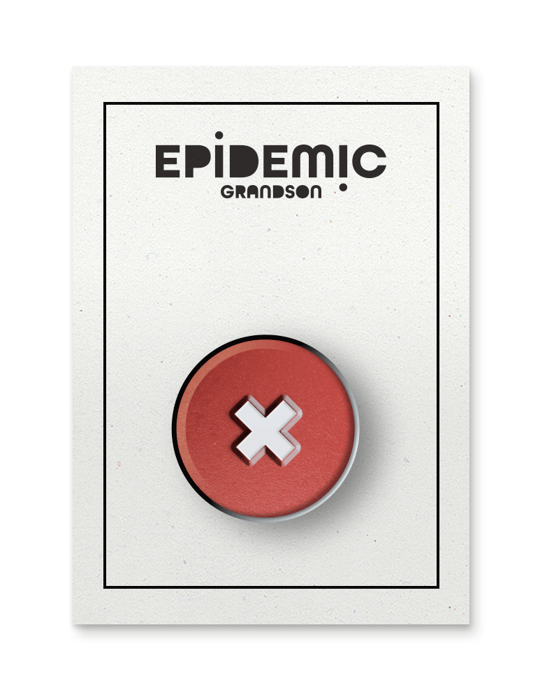
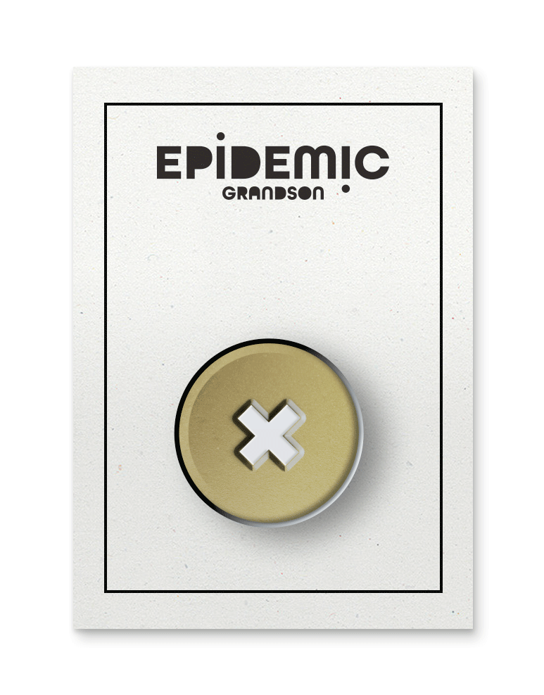
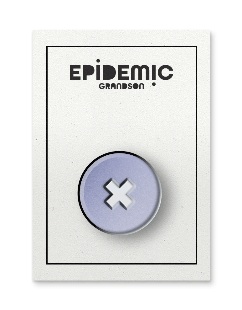
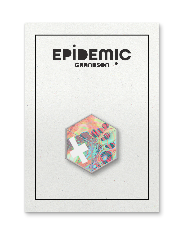
Pins
Each pin’s color is a reflection of the albums representing the main color of each album. The fourth pin underneath is a combination of all of the visual imagery I’ve used in this process, and I wanted it to contain a color of each album.
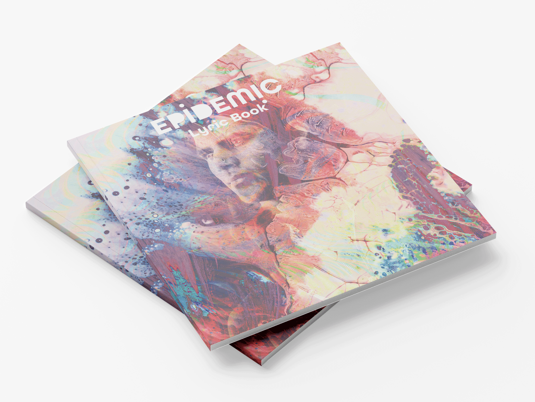
Lyric Book
The cover for the lyric book was based on not wanting to cater to one particular album. Along with the same idea of using a portrait as the main focus. The spreads are based around each album that they cater to with having a design that reflects that album. There’s an example of two spreads for each album. There is a thumbnail in the cover of the spreads that help identify them.
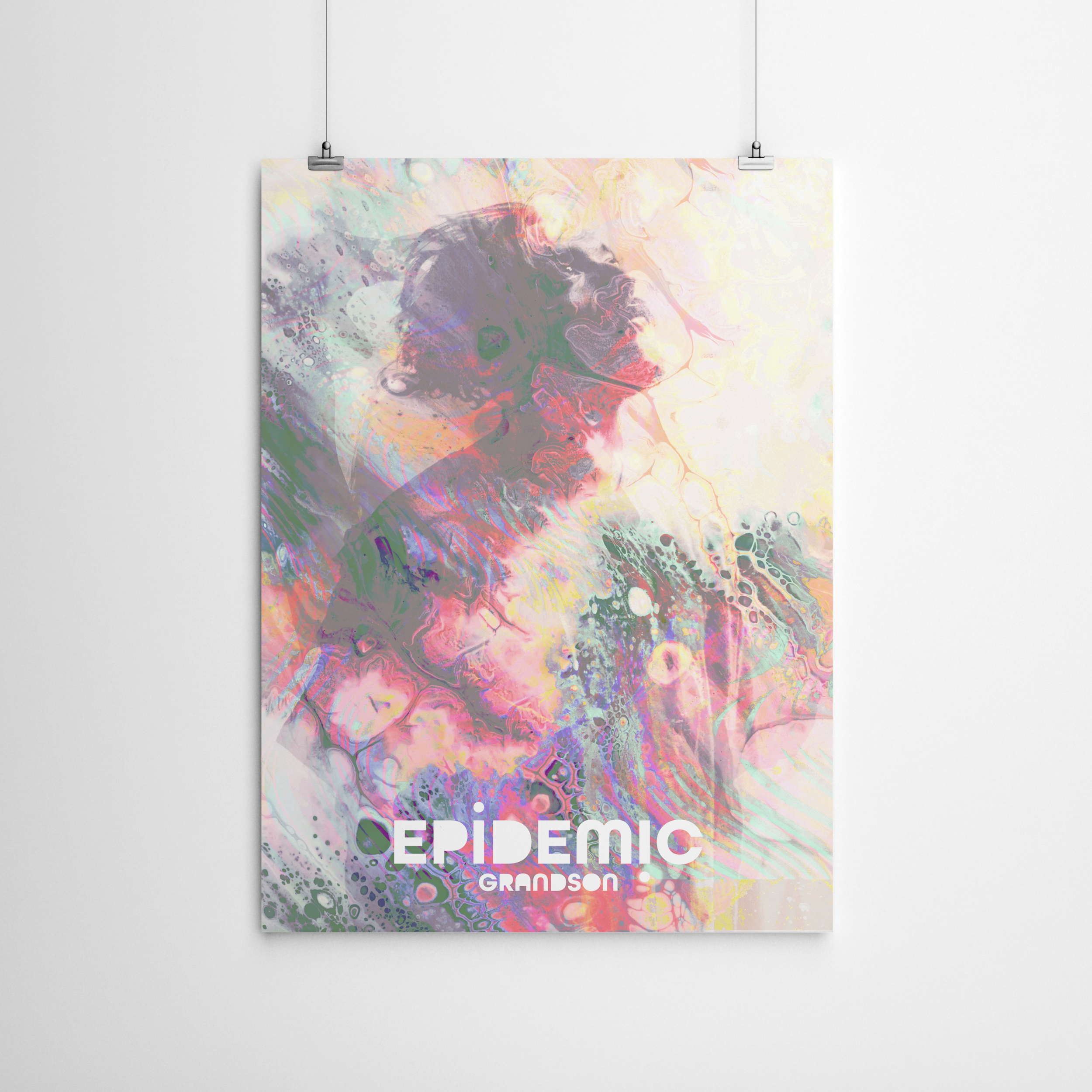
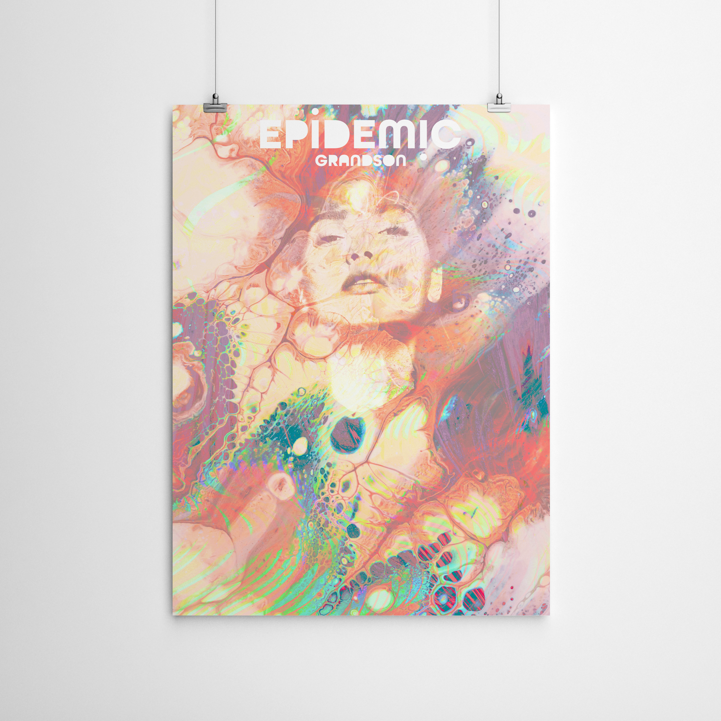
Posters
These are the posters that would be in this set. As mentioned visual textures of this are a combination of all of the textures used throughout the project. The posters needed to be something that had a bit of each album in them, and not just cater towards one. When deciding on these textures I wanted them overall to have a messy quality to them since the lyrics in these songs can be unclear sometimes and mean more than what they appear. I wanted various portraits of people’s faces since the songs are about different people’s struggles rather it being personal or external issues. Each theme includes a portrait as the main focus on the album cover so with the posters I applied the same treatment.
Motion Graphic
As mentioned the motion graphic is what would be used to promote the set on websites. This was made with after effects, and would only be played once if it was a real ad rather than be looped.